Free Watercolour Tutorial – Pleasure in the Detail… The Modern Painter Part 1
The modern painter is helped immensely by new technology. Here Helen Campbell takes traditional watercolour layering methods into the digital age to produce botanical studies that simply glow.
This tutorial is from the November 2014 edition of Leisure Painter Magazine.
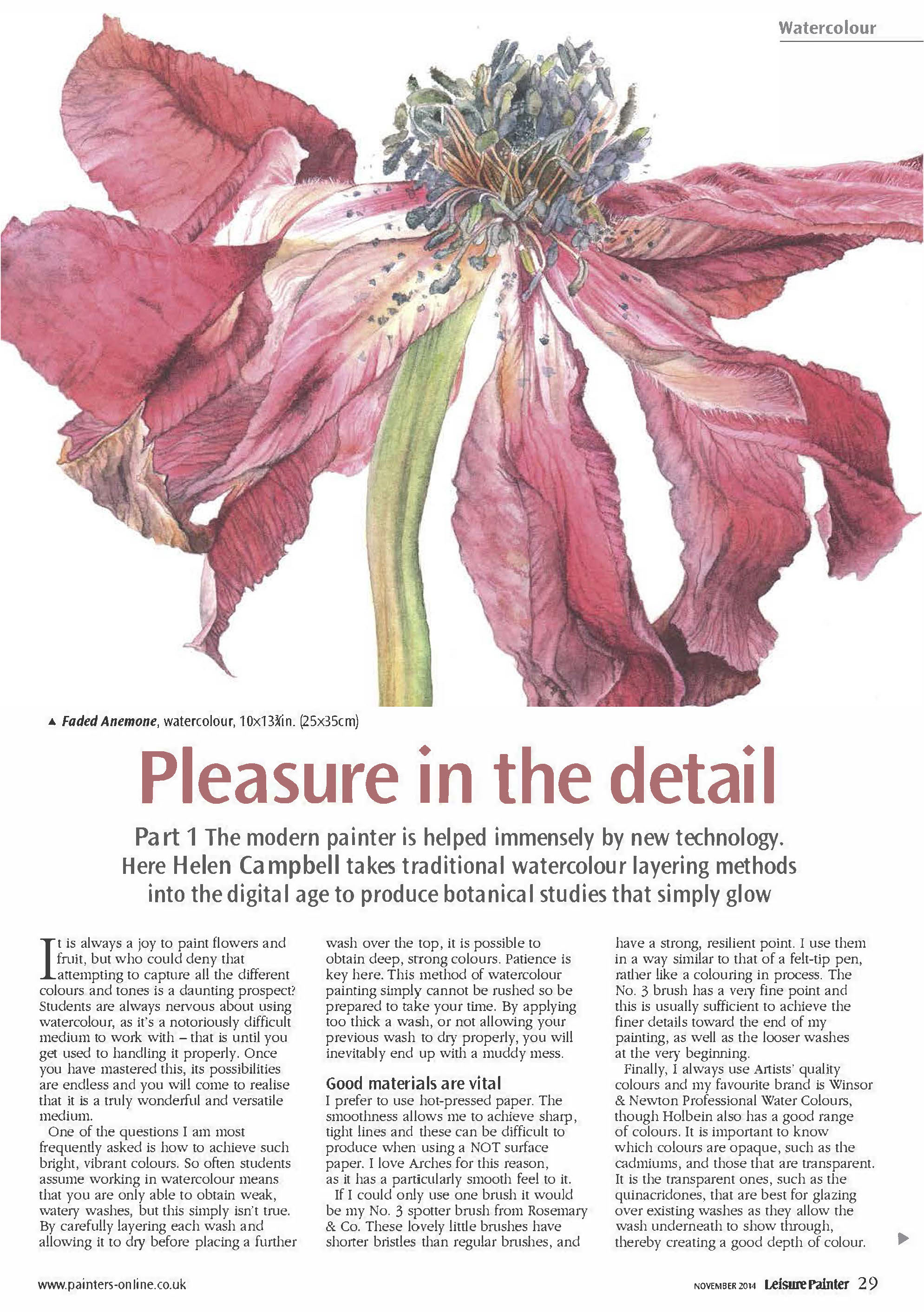
It is always a joy to paint flowers and fruit, but who could deny that attempting to capture all the different colours and tones is a daunting prospect? Students are always nervous about using watercolour, as it’s a notoriously difficult medium to work with – that is until you get used to handling it properly. Once you have mastered this, its possibilities are endless and you will come to realise that it is a timely wonderful and versatile medium.
One of the questions I am most frequently asked is how to achieve such bright, vibrant colours. So often students assume working in watercolour means that you are only able to obtain weak, watery washes, but this simply isn’t true. By carefully layering each wash and allowing it to dry before placing a further wash over the top, it is possible to obtain deep, strong colours. Patience is key here. This method of watercolour painting simply cannot be rushed so be prepared to take your tin1e. By applying too thick a wash, or not allowing your previous wash to dty properly, you will inevitably end up with a muddy mess.
Good materials are vital
I prefer to use hot-pressed paper. The smoothness allows me to achieve sharp, tight lines and these can be difficult to produce when using a NOT surface paper. I love Arches for this reason,
as it has a particularly smooth feel to it. If I could only use one brush it would be my No. 3 spotter brush from Rosemary & Co. These lovely little brushes have shorter bristles than regular brushes, and have a strong, resilient point. I use them in a way similar to that of a felt-tip pen, ratl1er like a colouring in process.
The No. 3 brush has a veiy fine point and this is usually sufficient to achieve the finer details toward the end of my painting, as well as the looser washes at the very beginning.
Finally, I always use Artists’ quality colours and my favourite brand is Winsor & Newton Professional Water Colours, though Holbein also has a good range of colours. It is important to know which colours are opaque, such as tl1e cadmiums, and those that are transparent. It is the transparent ones, such as the quinacridones, that are best for glazing over existing washes as they allow the wash underneath to show through, thereby creating a good depth of colour…
Click the link here or at top of page to download part 1 of the full PDF tutorial.